Showing posts with label work. Show all posts

Monday, 9 September 2013

Ashington Posters


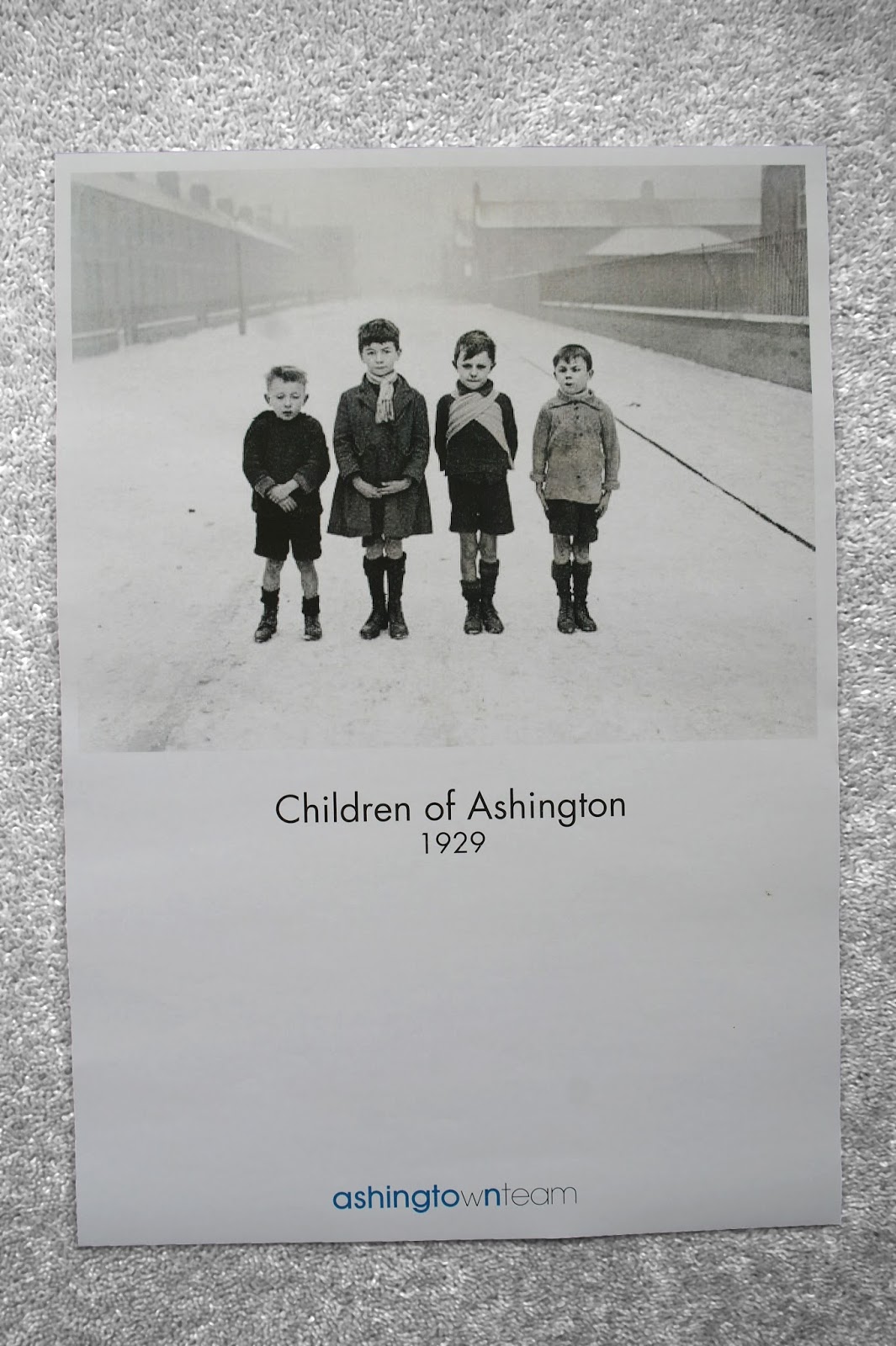
I produced four posters for Ashington Town Team incorporating the logo which I have designed. I found some old photographs of people and the town which could help show people what it used to be like. I included the dates of these in the poster. For the final poster which shows the new Ashington Leisure Centre I dated it 2015, which is the projected finish date. These work well as a series and could be displayed in various sites around the town. Posters could also incorporate photographs of the miners pit.


The photograph shows all the work which I completed for this project in my week of placement at Gardiner Richardson. Some of my ideas are going to be taken forward to show to the client in the first meeting.

Gardiner Richardson placement


I have recently done a placement at the graphic design agency Gardiner Richardson in Newcastle upon Tyne. I worked on a project for Ashington Town Team in the North East of England. The team needed a logo and brand identity. These are the initial sketches I made. I needed to make the logo contemporary, clean and simple. With this in mind I combined the words into one and differentiated the two using different weights of Futura. I believe this logo reflects the towns up and coming redevelopments.

Wednesday, 3 July 2013

Logo Designs

Logo designs I have created for Jonathan Shield Photography
Logo designs for 'Jonathan Shield Photography'. In the first logo I have explored the idea of the use of a shield, i.e. protecting something. And so have used the 'J' form to protect the rest of the text in the logo. In the second logo I incorporated a more literal form of a shield, forming this with the letter J. With the third logo I was just thinking about the simplicity of the type and the forms. 
After showing my designs at this stage to the photographer he did not like the literal visuals of a shield as he wanted something more subtle. He liked the simplicity of the typography in the final logo design and the shielding idea in the first design. These are the two aspects I will develop further in this. 
The photographer also wanted his logo to be able to be used in a branding sense with his work. Using the 'JS' as his identity. I will also explore this idea further, perhaps creating two finals; a logo and a stamp style design incorporating just the initials.

Sunday, 30 June 2013

Work experience - Tyneside Cinema


I am taking part in a work experience with a freelance graphic designer in Newcastle; David McClure who works under the name of Velcrobelly (www.velcrobelly.co.uk).  I have been working on a brochure for the Tyneside Cinema in Newcastle, these are a couple of screen shots of my progress so far. I have been trying to make the layouts visually interesting but still making it easy to read and informative. There have been challenges which I have worked through including fitting text to pages, yet still making the information flow well. Furthermore working in a studio space which is in The Biscuit Factory Art Gallery is a different experience to my normal university environment.

Monday, 20 May 2013

NHS Anti Smoking campaign


Final pieces for an Art Direction photography project in which I gave a brief outlining a concept for a NHS Anti Smoking campaign which held the slogan 'Light up your life not your death'. The brief included sketches of the photographs I wished to be taken. After receiving the photographs from the photographers I used them to form posters to be used in a campaign. These posters work well as a series as in the poster which focuses on the person's face it cannot be seen clearly that the 'cigarette' is in fact a candle. Although this is made more clean in the next poster. 'Light up your life not your death' i.e. light up something other than a cigarette - a candle.

Tuesday, 7 May 2013

Module hand in


Final Year 2 Graphic Design module handed in today. 4 projects; Design Society, Niche Guide, YCN - Lego and Exhibition. 

Thursday, 2 May 2013

Hanging rose paper model


Paper models to explore the form of a hanging rose which will be placed in the middle of my Rob Ryan exhibition 'Raining Roses'. The textural qualities in this piece will contrast well with plain forms which will include text information.

Wednesday, 1 May 2013

Rob Ryan Exhibition Models


Models for an exhibition project based upon the work of paper cutting artist Rob Ryan. The name of the exhibition is 'Raining Roses'. Making models of objects to be placed around the museum and inside the exhibition space. As Ryan uses leaves in his work I have incorporated these into my designs. I plan to wrap and bind these leaves around the fence at the entrance of the gallery. These paper models will accompany detailed sketches of areas around the exhibition.

Sunday, 28 April 2013

Niche guide typography


Typography in my Christmas hats niche guide; stitching into fabric.

Christmas Hats Niche Guide


Niche guide on Christmas hats, I have done the visuals in the guide by sewing people with different Christmas hats on. This gives a 'cutesy' feel to the guide which is when combined with the small format (10x15cm) makes it suitable for carrying on the person or in a handbag. Text has been added to give a sense of humour to the guide. Also the colour of stitching I have used to help if the person reading it wanted to make the hat themselves. I have bound the guide with a knitted strip to give a more textural feel. The pages of fabric themselves smell of cinnamon and nutmeg spices as they were painted with these before sewing into them. Giving an added sense of Christmas.

Wednesday, 10 April 2013

YCN Lego photography


Photography for a Lego poster campaign bearing the slogan 'Shaping Young Heroes'. These heroes could be in the new Marvel superheroes range of Lego, although I find it more interesting to focus on people in the community whom can be classed as heroes. These photographs portray a doctor, police person and firefighter. I believe this gives out the correct message about Lego but also aspires children to want to help others. These photographs will be made into posters for the campaign. With the slogan 'Shaping Young Heroes' and the counter slogan 'Let Lego shape you'.

Thursday, 4 April 2013

Experimenting how to make paper smell Christmassy


Testing and experimenting with various spices and herbs to make paper smell christmassy. Doing this by soaking, mixing, painting and covering paper with whole nutmeg, mixed spice, thyme, dry roasted peanuts and mixed berry room mist. I like the nutmeg and mixed spice smells the best, I need to experiment more with combining these smells with other materials such as fabric. I will also continue to experiment with ground nutmeg and cinnamon. 

Tuesday, 2 April 2013

Photography for NHS anti smoking campaign

 Photography with slightly different editing in each one
In my Digital Photography module for an Art Direction project we had to create briefs and take photographs in pairs for an NHS anti smoking campaign. This the photograph I have chosen for the campaign which I am doing a poster for which includes the slogan 'Light up your life, not your death'. The idea involves lighting up something other than a cigarette. In this case it is a candle. I like the overall composition of this photograph and believe it will work well with the text of the poster to the right of it. Decreasing the hierarchy of the background in this image was done by reducing the saturation in the image. The black and white and full white backgrounds are too heavily edited for this purpose. Although I like the more subtle changes in the other images.

Tuesday, 5 February 2013

Rob Ryan exhibition project

I like the simple design in this, the hearts and shapes could be used in either the poster work or the name of the exhibition itself.


Can explore ideas of the paper cutting and being able to see through the work from every view point in the exhibition. Will think about different ways to display the work.

Producing promotional material for the exhibition will also involve creating a typeface inspired by Rob Ryan's work.

Typeface created by Rob Ryan and placed onto tote bags. I love the added flowers and birds in these as little extra details.
Researching work for a Rob Ryan exhibition project in which I will produce a name for the exhibition, design the environmental graphics and the promotional materials. Uses the theme of love in my work as the main influence I began researching his work. Image and shapes within the work and text will influence me in this.

Tuesday, 29 January 2013

YCN Lego idea

Do something with your hands campaign

My current idea for a Lego campaign. Following the idea that parents want children to do something rather than just watch watch television or play video games. The sense of pride and achievement of making something yourself from your imagination is in my view the key to Lego. Using michaelangelo's famous hand painting from the Sistine chapel in Rome to demonstrate this I thought about various formats for the campaign. Thinking about making it interactive and available to a large audience I thought about making large scale hands made out of Lego and placing it in a highly populated area such as London.