Showing posts with label newcastle. Show all posts

Monday, 9 September 2013

Ashington Posters


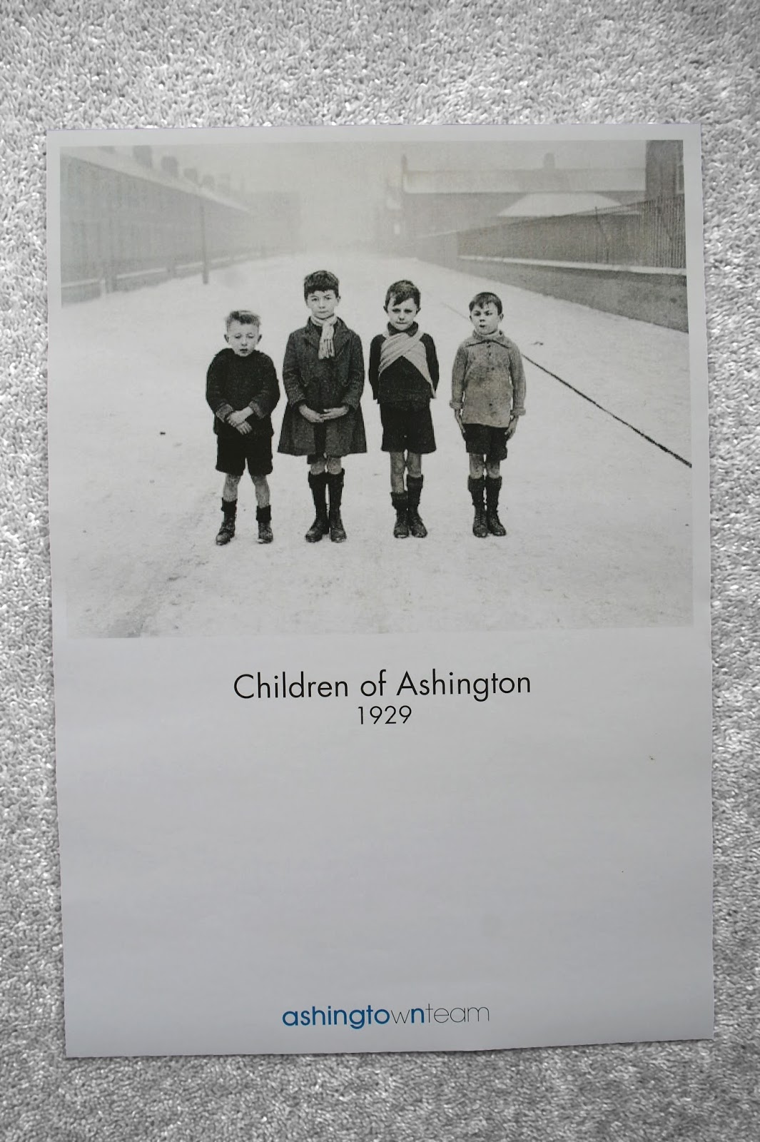
I produced four posters for Ashington Town Team incorporating the logo which I have designed. I found some old photographs of people and the town which could help show people what it used to be like. I included the dates of these in the poster. For the final poster which shows the new Ashington Leisure Centre I dated it 2015, which is the projected finish date. These work well as a series and could be displayed in various sites around the town. Posters could also incorporate photographs of the miners pit.


The photograph shows all the work which I completed for this project in my week of placement at Gardiner Richardson. Some of my ideas are going to be taken forward to show to the client in the first meeting.

Ashington Town Team


With the logo design the team also wanted a variety of colours which they could use alongside this in their documents, letterheads etc. I researched various coloured logos including yellow and orange and applied these to the Ashington town team logo. The logo also had to work well with others such as the Ashington Town Council and the Northumberland County Council. With this in mind I thought either yellow or blue could work well. The team also wanted to know which supporting typefaces to use and so I decided on Futura and Avant Garde. These are simple and contemporary which confirms the town team's ideas for Ashington.

Gardiner Richardson placement


I have recently done a placement at the graphic design agency Gardiner Richardson in Newcastle upon Tyne. I worked on a project for Ashington Town Team in the North East of England. The team needed a logo and brand identity. These are the initial sketches I made. I needed to make the logo contemporary, clean and simple. With this in mind I combined the words into one and differentiated the two using different weights of Futura. I believe this logo reflects the towns up and coming redevelopments.

Wednesday, 3 July 2013

Logo Designs

Logo designs I have created for Jonathan Shield Photography
Logo designs for 'Jonathan Shield Photography'. In the first logo I have explored the idea of the use of a shield, i.e. protecting something. And so have used the 'J' form to protect the rest of the text in the logo. In the second logo I incorporated a more literal form of a shield, forming this with the letter J. With the third logo I was just thinking about the simplicity of the type and the forms. 
After showing my designs at this stage to the photographer he did not like the literal visuals of a shield as he wanted something more subtle. He liked the simplicity of the typography in the final logo design and the shielding idea in the first design. These are the two aspects I will develop further in this. 
The photographer also wanted his logo to be able to be used in a branding sense with his work. Using the 'JS' as his identity. I will also explore this idea further, perhaps creating two finals; a logo and a stamp style design incorporating just the initials.

Sunday, 30 June 2013

Work experience - Tyneside Cinema


I am taking part in a work experience with a freelance graphic designer in Newcastle; David McClure who works under the name of Velcrobelly (www.velcrobelly.co.uk).  I have been working on a brochure for the Tyneside Cinema in Newcastle, these are a couple of screen shots of my progress so far. I have been trying to make the layouts visually interesting but still making it easy to read and informative. There have been challenges which I have worked through including fitting text to pages, yet still making the information flow well. Furthermore working in a studio space which is in The Biscuit Factory Art Gallery is a different experience to my normal university environment.