Showing posts with label graphic design. Show all posts

Sunday, 16 March 2014

D&AD Make Your Mark - The fabric of my life


This year I am entering my work into the D&AD New Blood Awards for the Make your mark brief. I had to think of something which made me different to everyone else. 

I believe my craft skills make me different from others along with the handmade feel. Being able to pick something up and feel the textures and look closely at the details is something important to me. This 'book' named 'The fabric of my life' opens up to be a patchwork wall hanging. It includes 21 squares, each pattern related to what I wore on each one of my birthdays.

This book is unique to myself. The loose stitching style I have used give the feel of imperfection, something which reflects myself. 
No-one is perfect!


The back of the book includes a pocket which inside holds a key to the patchwork. Explaining each pattern and its relevance to myself.


Thursday, 6 March 2014

Afternoon Chinese Tea


Continuing my purposed range for Cath Kidston I have developed an afternoon colour scheme to apply to a pattern. Appealing these to teapots and teacups in the same style as previous posts. The next step in this project is to layout all these elements together in a pattern. To be ultimately transferred onto homeware, fashion and accessories. 

Thursday, 20 February 2014

Morning Chinese Tea

As part of the YCN Cath Kidston pattern in which I am creating I need to think of three different colour ways as part of the competition criteria. The patterns I am creating relate to chinese tea; the previous pattern was influenced by the neon lights in Hong Kong and so has a night time influence. 

I am therefore thinking about morning and afternoon times for the other two colour ways. These being the times that people have tea and the different reasons for this. The morning to start off the day and the afternoon to relax and socialise with friends. Firstly thinking about morning tea I have created this coloured patterns of parasols and lanterns.


Similar to the style of the night time teapots and teacups and applied this pattern to the same objects as seen below. These are striking as either individual pieces or together as an element in a pattern. These are fresh, bright and appealing; encompassing the feel and vibe of a bright new day.


Tuesday, 11 February 2014

Chinese tea - Cath Kidston patterns


For my final major project at university I am creating a new pattern for a Cath Kidston range as part of a YCN student competition. Choosing an oriental theme I was inspired by Chinese lanterns, parasols and tea. Creating a pattern by combining these three elements has created something interesting. The colour scheme is inspired from neon lights in Hong Kong which hold bright, vibrant colours. These are fun and quirky, something which I believe the Cath Kidston brand represents.


Tuesday, 4 February 2014

Self Promotion


As part of my professional practice module at university I am creating a logo for myself to apply to business cards, letterheads, personal portfolio, cv etc. 

My work has a handmade feel which I want to portray in the materials I use to produce both my logo and the items it will be placed on. I have experiments with stitching and stamping. The idea of producing something which will be placed slightly differently on each item by a stamp is something which interests me. 

These are the initial sketches and ideas I have produced so far. I am planning to use a neutral colour scheme which links with my current project work which will be in my portfolio.

Sunday, 19 January 2014

Life is Tweet


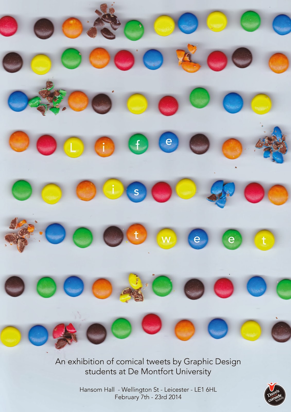
My poster for an exhibition which is part of the Leicester Comedy Festival next month (February 2014). The exhibition includes a series of graphic interpretations of funny tweets by Graphic Design students at De Montfort University. 

My inspiration for the poster was playing on the phrase 'life is sweet' by lining up sweets. The ironic side of this is that some of those sweets are broken. Furthermore they could be said to look like small tablets lined up on a table.

Tuesday, 3 December 2013

Let's get this craft started! Magazine


Developing my work for the craft magazine I am creating as part of my final year of my Graphic Design degree I have explored further with typography. The piece above was created using a sewing machine and then hand stitching. This is stitched onto tracing paper as I like the visual excitement of being able to see all the lose threads as well. This scan will be used on the front page of the magazine. Each issue will have the name created in different forms of craft i.e. fabric and collage.


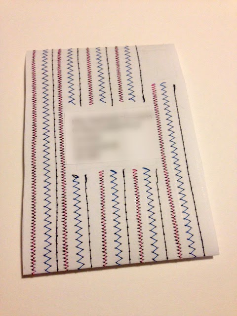
This is a mock up of how I will send out the magazine each week. This belly bound format will be stitched into like seen above. Each week a different pattern and colour scheme. The address will be placed in the centre and a stamp in the right corner; like normal letters. The magazine will be placed through the centre. This will actually be stitched onto paper for each person receiving the magazine, as apposed to the other pages which will all be scanned images.


Tuesday, 19 November 2013

Bookmaking


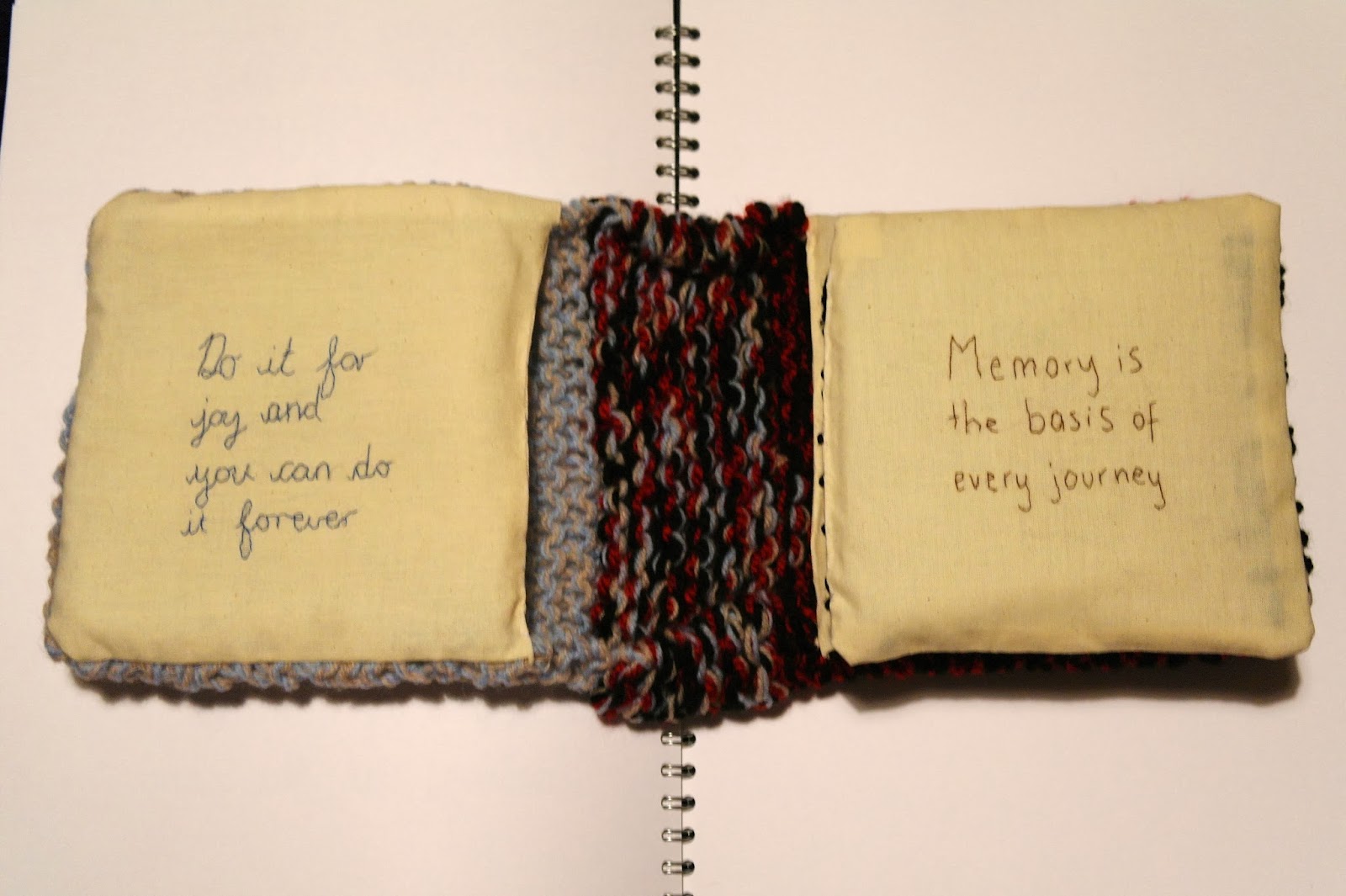
This is the experimental book which I have produced for the first half of my bookmaking project in my first term of third year Graphic Design. The book related to home, the textures and feel of the book remind me of home. The knitting symbolises where I learnt for to knit and by whom; my grandma. The book immediately looks cosy and inviting, the same qualities I believe that my home has. The inside pages are covered with Stephen King quotes as he is an author loved by all of my family. 
At first the quotes are inspirational and thought provoking whereas towards the back of the book it becomes more in the style of horror of which Stephen King is famous for. The first impressions of this book are that of kindness of warmth, the more the journey of the book takes place the colours, obscurity and feel changes.


The gradual change of feel in the book can clearly be seen in these layout photographs. At first the text is stitched in joint up handwriting eventually becoming red stamp text which is obscured to look like blood. This relates to some of the characters in Stephen King's novel such as the clown in IT. I enjoy this sense of change in the book and the different in visual language on each page. Causing the book to become more appealing to the viewer and exciting.


The above photographs show the pouch that I created in the front and back covers of the book. Here I will place secret items that can only be seen if the viewer finds them as they are well hidden within the knitting. In the front blue/beige cover I will place positive and happy things such as shown here a letter I received from my Gran. Whereas in the back black/red cover which reflects more of the horror side I will place unhappy and negative things. I believe this adds an exciting feature to the book which only the most inquisitive minds will discover.

Tuesday, 5 November 2013

Stitching Typography - Let's get this craft started!


Developing typography for a craft magazine which I am creating. The magazine is aimed at young adults, I am currently working with the name 'Let's get this craft started!'. The magazine will be mostly 'how to' project based but also have themes of activities to do such as what to listen to, what to watch and what to snack on while doing the projects. I want to make the typography for the magazine title fun and appealing to the young audience. I have stitched into fabric and then scanned these images into Photoshop. 
This second experiment is more visually interesting and needs further development to make it a stronger image. I combined the front and back of the stitching to create this typography. I like the rough, handmade feel of the loose threads left at the back of the stitching. My plan is to develop different typography with craft and textiles materials so that each issue will have a title made out of different materials. Further development of the exclamation mark at the end of the title will also take place. I want to make this a focus so that the magazine can be recognised by this without the words. 


Thursday, 17 October 2013

New love - Flow Magazine


For my Major Negotiated Project (MNP) in my final year of my degree which I have just started I am aiming to create a new craft magazine for the young adult audience. 

Through my research into similar magazines which have this approach I discovered Flow magazine. It is based in The Netherlands although has recently started to produce international issues. I immediately fell in love with the look and feel of this magazine. And the style it holds which is transferred into the website. (http://www.flowmagazine.com)

Flow describes itself; "Flow Magazine International is a magazine for paper lovers. We love crafting, mindfulness, illustrations, and positive psychology, and we celebrate the handmade and imperfect." This sense of having fun and enjoying yourself is something I wish to transfer into the craft magazine market. 

Everything about the magazine from the front covers designs, layouts and packaging for the consumer market intrigues me to learn more. 


I love the look of this magazine when it is on the shelf. I understand the importance of this as this is what the consumer is seeing when they decide whether or not to buy the magazine. It definitely would stand out for me and catch my eye. 

My copy of Issue 2 is in the post on the way to me, I cannot wait until it arrives. Issue 3 has just been launched!!

Monday, 9 September 2013

Ashington Posters


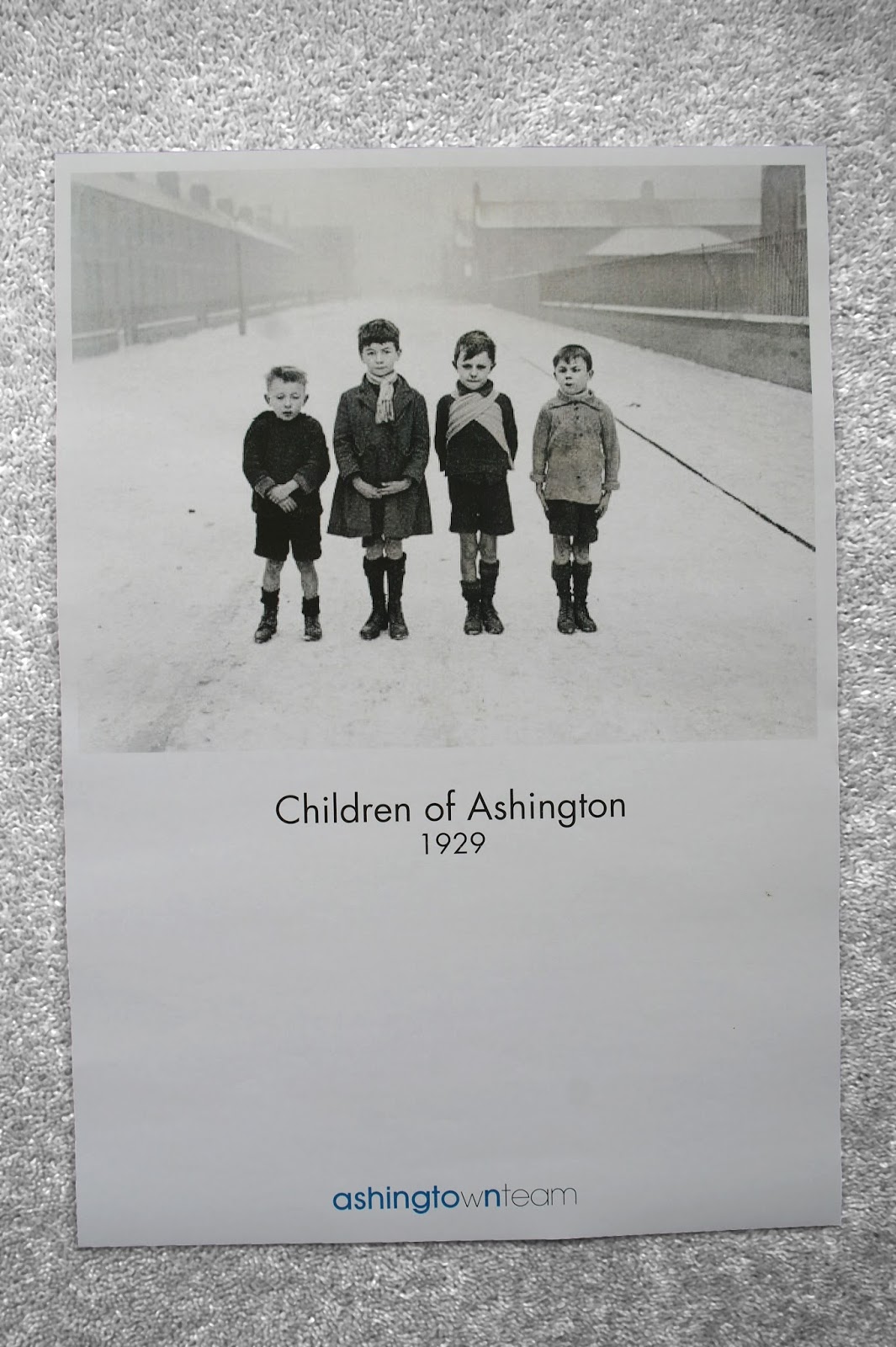
I produced four posters for Ashington Town Team incorporating the logo which I have designed. I found some old photographs of people and the town which could help show people what it used to be like. I included the dates of these in the poster. For the final poster which shows the new Ashington Leisure Centre I dated it 2015, which is the projected finish date. These work well as a series and could be displayed in various sites around the town. Posters could also incorporate photographs of the miners pit.


The photograph shows all the work which I completed for this project in my week of placement at Gardiner Richardson. Some of my ideas are going to be taken forward to show to the client in the first meeting.

Ashington Town Team


With the logo design the team also wanted a variety of colours which they could use alongside this in their documents, letterheads etc. I researched various coloured logos including yellow and orange and applied these to the Ashington town team logo. The logo also had to work well with others such as the Ashington Town Council and the Northumberland County Council. With this in mind I thought either yellow or blue could work well. The team also wanted to know which supporting typefaces to use and so I decided on Futura and Avant Garde. These are simple and contemporary which confirms the town team's ideas for Ashington.

Gardiner Richardson placement


I have recently done a placement at the graphic design agency Gardiner Richardson in Newcastle upon Tyne. I worked on a project for Ashington Town Team in the North East of England. The team needed a logo and brand identity. These are the initial sketches I made. I needed to make the logo contemporary, clean and simple. With this in mind I combined the words into one and differentiated the two using different weights of Futura. I believe this logo reflects the towns up and coming redevelopments.

Sunday, 30 June 2013

Work experience - Tyneside Cinema


I am taking part in a work experience with a freelance graphic designer in Newcastle; David McClure who works under the name of Velcrobelly (www.velcrobelly.co.uk).  I have been working on a brochure for the Tyneside Cinema in Newcastle, these are a couple of screen shots of my progress so far. I have been trying to make the layouts visually interesting but still making it easy to read and informative. There have been challenges which I have worked through including fitting text to pages, yet still making the information flow well. Furthermore working in a studio space which is in The Biscuit Factory Art Gallery is a different experience to my normal university environment.

Friday, 17 May 2013

Commissioned Portrait final piece


Commissioned Portrait final piece; detailed shot of coloured thread.

Commissioned Portrait Final Piece


Commissioned Portrait final piece, photographing and interviewing a craft shop owner to gain an insight into this area of art and design. 

Tuesday, 7 May 2013

Module hand in


Final Year 2 Graphic Design module handed in today. 4 projects; Design Society, Niche Guide, YCN - Lego and Exhibition.