Showing posts with label craft. Show all posts

Sunday, 16 March 2014

D&AD Make Your Mark - The fabric of my life


This year I am entering my work into the D&AD New Blood Awards for the Make your mark brief. I had to think of something which made me different to everyone else. 

I believe my craft skills make me different from others along with the handmade feel. Being able to pick something up and feel the textures and look closely at the details is something important to me. This 'book' named 'The fabric of my life' opens up to be a patchwork wall hanging. It includes 21 squares, each pattern related to what I wore on each one of my birthdays.

This book is unique to myself. The loose stitching style I have used give the feel of imperfection, something which reflects myself. 
No-one is perfect!


The back of the book includes a pocket which inside holds a key to the patchwork. Explaining each pattern and its relevance to myself.


Tuesday, 3 December 2013

Let's get this craft started! Magazine


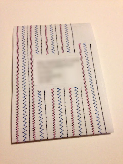
Developing my work for the craft magazine I am creating as part of my final year of my Graphic Design degree I have explored further with typography. The piece above was created using a sewing machine and then hand stitching. This is stitched onto tracing paper as I like the visual excitement of being able to see all the lose threads as well. This scan will be used on the front page of the magazine. Each issue will have the name created in different forms of craft i.e. fabric and collage.


This is a mock up of how I will send out the magazine each week. This belly bound format will be stitched into like seen above. Each week a different pattern and colour scheme. The address will be placed in the centre and a stamp in the right corner; like normal letters. The magazine will be placed through the centre. This will actually be stitched onto paper for each person receiving the magazine, as apposed to the other pages which will all be scanned images.


Tuesday, 19 November 2013

Bookmaking


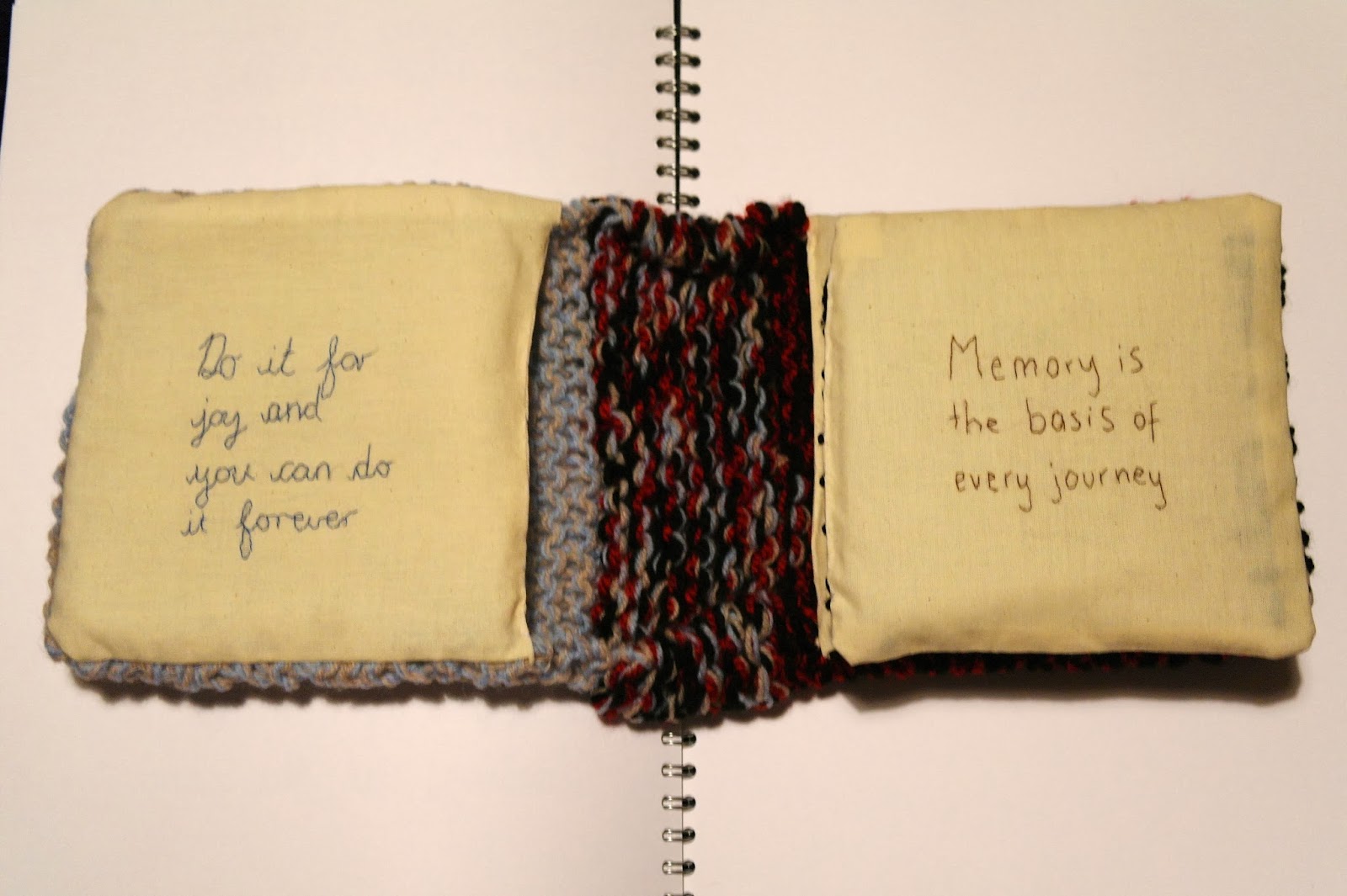
This is the experimental book which I have produced for the first half of my bookmaking project in my first term of third year Graphic Design. The book related to home, the textures and feel of the book remind me of home. The knitting symbolises where I learnt for to knit and by whom; my grandma. The book immediately looks cosy and inviting, the same qualities I believe that my home has. The inside pages are covered with Stephen King quotes as he is an author loved by all of my family. 
At first the quotes are inspirational and thought provoking whereas towards the back of the book it becomes more in the style of horror of which Stephen King is famous for. The first impressions of this book are that of kindness of warmth, the more the journey of the book takes place the colours, obscurity and feel changes.


The gradual change of feel in the book can clearly be seen in these layout photographs. At first the text is stitched in joint up handwriting eventually becoming red stamp text which is obscured to look like blood. This relates to some of the characters in Stephen King's novel such as the clown in IT. I enjoy this sense of change in the book and the different in visual language on each page. Causing the book to become more appealing to the viewer and exciting.


The above photographs show the pouch that I created in the front and back covers of the book. Here I will place secret items that can only be seen if the viewer finds them as they are well hidden within the knitting. In the front blue/beige cover I will place positive and happy things such as shown here a letter I received from my Gran. Whereas in the back black/red cover which reflects more of the horror side I will place unhappy and negative things. I believe this adds an exciting feature to the book which only the most inquisitive minds will discover.

Tuesday, 5 November 2013

Stitching Typography - Let's get this craft started!


Developing typography for a craft magazine which I am creating. The magazine is aimed at young adults, I am currently working with the name 'Let's get this craft started!'. The magazine will be mostly 'how to' project based but also have themes of activities to do such as what to listen to, what to watch and what to snack on while doing the projects. I want to make the typography for the magazine title fun and appealing to the young audience. I have stitched into fabric and then scanned these images into Photoshop. 
This second experiment is more visually interesting and needs further development to make it a stronger image. I combined the front and back of the stitching to create this typography. I like the rough, handmade feel of the loose threads left at the back of the stitching. My plan is to develop different typography with craft and textiles materials so that each issue will have a title made out of different materials. Further development of the exclamation mark at the end of the title will also take place. I want to make this a focus so that the magazine can be recognised by this without the words. 


Friday, 17 May 2013

Commissioned Portrait final piece


Commissioned Portrait final piece; detailed shot of coloured thread.

Commissioned Portrait Final Piece


Commissioned Portrait final piece, photographing and interviewing a craft shop owner to gain an insight into this area of art and design. 

Thursday, 18 April 2013

Practice Fabric Zine


Mock up zine named 'Converse:Converge'. Testing how well the design would transfer onto fabric. This needs further testing with other fabric, thicker seems like it would work better. I think the idea of printing my zine onto fabric rather than paper is a good one however. I believe this could be very successful when placed onto better fabric and on a larger scale and the details worked on further.


Wednesday, 17 April 2013

'Make your wardrobe happy' typeface


Text in a poster for a design society event named 'Make your wardrobe happy'. Made using various layers of a scanned print I made of clothes forming a smiley face in the negative space. Placing these in letter forms I drew and then scanned into Photoshop. The text is being used as the main focus of the poster rather than an image.

Monday, 8 April 2013

Make your wardrobe happy


Poster for a Design Society event at De Montfort University, Leicester which I have made up. The idea consists of bringing old and worn clothes and recycling, upcycling and redesigning them. This could be through craft and textiles or simply putting a new design on the front which would have been created by one of the student graphic designers. This is a work in progress, I like the colours in this as it gives out a fresh vibe. Brighten up your wardrobe! Make your wardrobe happy! 

Wednesday, 23 January 2013

Converse quote

Converse quote double spread
For the final double spread in my converse zine I wanted a quote about converse as it would be the last words in the zine. I found this quote on the converse website with the company brand values - "We've been around long enough to learn its not about how old you are, but how good you are - and that everyone loves a good story". Saying Converse change and adapt to the current markets and continue to dominant the market after many years. People say the original is always the best. I created this page by using hand rendered text for the typography. I used printing ink and a roller on a glass surface and create a print of the converse shoe. Painting a textured surface with paint and then transferring it onto paper created the background effect. They all come together well in this final double spread of my zine. Further work may need to be done with the layout of the text.

Monday, 21 January 2013

Colour is important

Choosing fabrics
Screen grabs of colours palettes

Colour is important. Choosing colours for the zine I am creating. Chose blues, purples and pinks; with variations of tones. Finding fabrics which I liked either the colour or pattern of as after scanning into Photoshop I could manipulate the colours if they were not to my colour scheme. Such as the red tissue paper which I only chose for the texture. Combining this colour scheme to my zine, postcards and poster I will be creating gives a great sense of continuity in my work. Could also be expanded onto promotional materials for the zine if it was to be a real product on the market such as leaflets, t shirts etc.

Sewing a shoe

Converse shoe stitched into my sketchbook

Postcard linking to zine
With the idea of creating a postcard which linked in with my theme for the zine of Converse I concentrated my love of fabrics and stitching to look into this aspect of Converse. I stitched a shoe from a various of threads which included my colour schemes. With the idea of producing a postcard in mind I used this shoe for the main design. By scanning a number of fabrics and wool in the shape of the letters 'With Love' I was able to piece it together in Photoshop. I like the cute feel which I have produced in this, something different to the traditional feel on the Converse campaigns. I played around with the layout of the back to make sure when transferred into In Design and ready for print none of the design would be lost when exported with the bleed lines.

Saturday, 19 January 2013

Frankie Magazine

Newly discovered magazine from Aus, incorporates design, art, photography, travel, music and crafts in one. Whats not to love?!

Becoming my bible for a current editorial photography project.