Tuesday, 19 November 2013

Bookmaking


This is the experimental book which I have produced for the first half of my bookmaking project in my first term of third year Graphic Design. The book related to home, the textures and feel of the book remind me of home. The knitting symbolises where I learnt for to knit and by whom; my grandma. The book immediately looks cosy and inviting, the same qualities I believe that my home has. The inside pages are covered with Stephen King quotes as he is an author loved by all of my family. 
At first the quotes are inspirational and thought provoking whereas towards the back of the book it becomes more in the style of horror of which Stephen King is famous for. The first impressions of this book are that of kindness of warmth, the more the journey of the book takes place the colours, obscurity and feel changes.
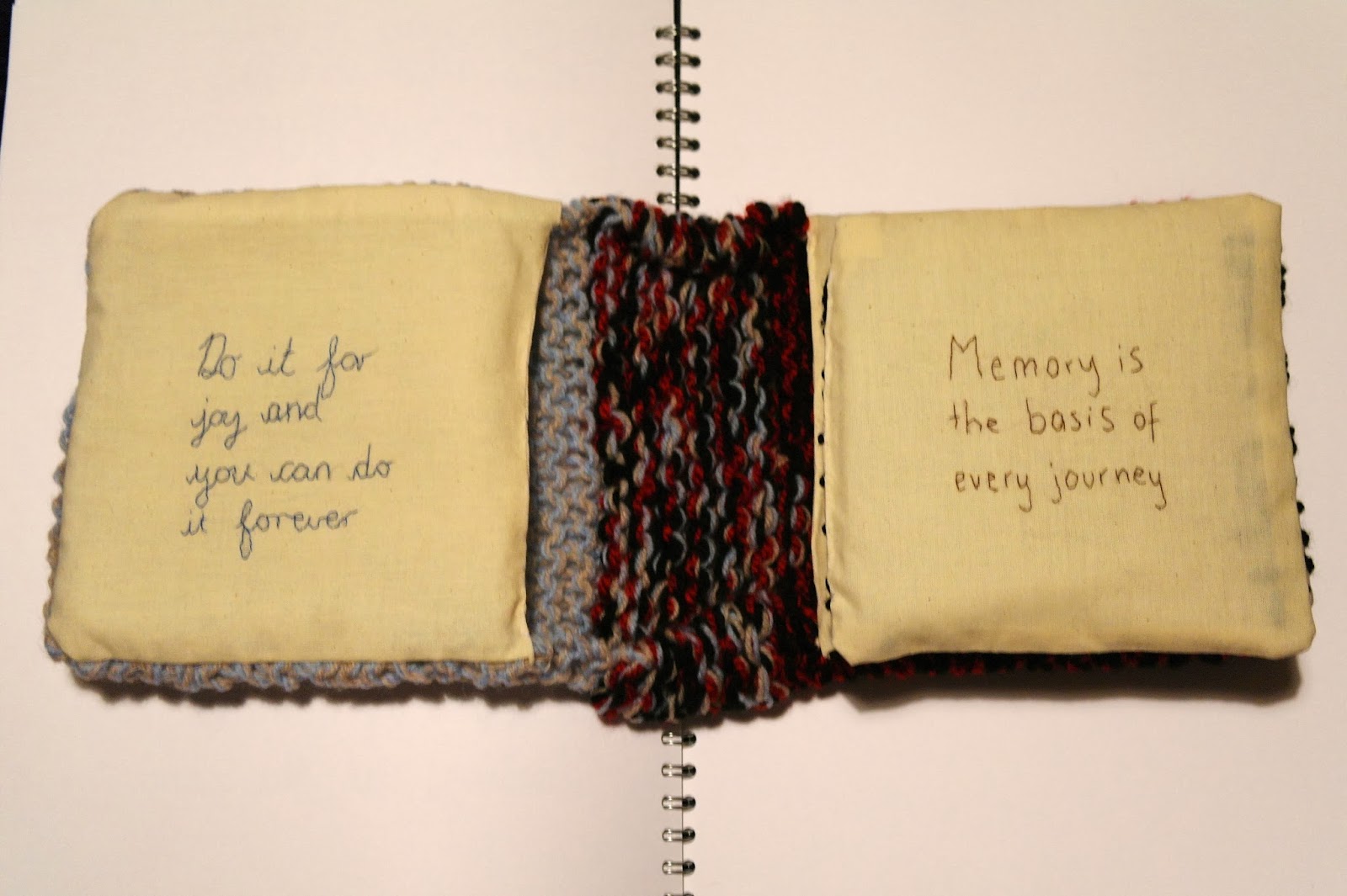


The gradual change of feel in the book can clearly be seen in these layout photographs. At first the text is stitched in joint up handwriting eventually becoming red stamp text which is obscured to look like blood. This relates to some of the characters in Stephen King's novel such as the clown in IT. I enjoy this sense of change in the book and the different in visual language on each page. Causing the book to become more appealing to the viewer and exciting.


The above photographs show the pouch that I created in the front and back covers of the book. Here I will place secret items that can only be seen if the viewer finds them as they are well hidden within the knitting. In the front blue/beige cover I will place positive and happy things such as shown here a letter I received from my Gran. Whereas in the back black/red cover which reflects more of the horror side I will place unhappy and negative things. I believe this adds an exciting feature to the book which only the most inquisitive minds will discover.

Tuesday, 5 November 2013

Stitching Typography - Let's get this craft started!


Developing typography for a craft magazine which I am creating. The magazine is aimed at young adults, I am currently working with the name 'Let's get this craft started!'. The magazine will be mostly 'how to' project based but also have themes of activities to do such as what to listen to, what to watch and what to snack on while doing the projects. I want to make the typography for the magazine title fun and appealing to the young audience. I have stitched into fabric and then scanned these images into Photoshop. 
This second experiment is more visually interesting and needs further development to make it a stronger image. I combined the front and back of the stitching to create this typography. I like the rough, handmade feel of the loose threads left at the back of the stitching. My plan is to develop different typography with craft and textiles materials so that each issue will have a title made out of different materials. Further development of the exclamation mark at the end of the title will also take place. I want to make this a focus so that the magazine can be recognised by this without the words. 


Thursday, 17 October 2013

New love - Flow Magazine


For my Major Negotiated Project (MNP) in my final year of my degree which I have just started I am aiming to create a new craft magazine for the young adult audience. 

Through my research into similar magazines which have this approach I discovered Flow magazine. It is based in The Netherlands although has recently started to produce international issues. I immediately fell in love with the look and feel of this magazine. And the style it holds which is transferred into the website. (http://www.flowmagazine.com)

Flow describes itself; "Flow Magazine International is a magazine for paper lovers. We love crafting, mindfulness, illustrations, and positive psychology, and we celebrate the handmade and imperfect." This sense of having fun and enjoying yourself is something I wish to transfer into the craft magazine market. 

Everything about the magazine from the front covers designs, layouts and packaging for the consumer market intrigues me to learn more. 


I love the look of this magazine when it is on the shelf. I understand the importance of this as this is what the consumer is seeing when they decide whether or not to buy the magazine. It definitely would stand out for me and catch my eye. 

My copy of Issue 2 is in the post on the way to me, I cannot wait until it arrives. Issue 3 has just been launched!!

Monday, 9 September 2013

Ashington Posters


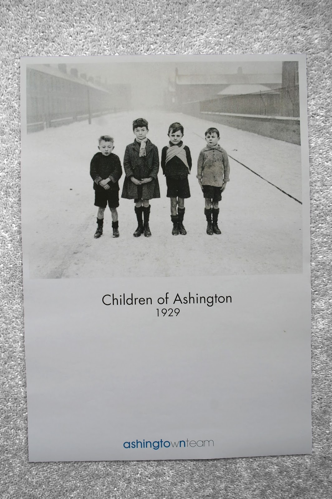
I produced four posters for Ashington Town Team incorporating the logo which I have designed. I found some old photographs of people and the town which could help show people what it used to be like. I included the dates of these in the poster. For the final poster which shows the new Ashington Leisure Centre I dated it 2015, which is the projected finish date. These work well as a series and could be displayed in various sites around the town. Posters could also incorporate photographs of the miners pit.


The photograph shows all the work which I completed for this project in my week of placement at Gardiner Richardson. Some of my ideas are going to be taken forward to show to the client in the first meeting.

Ashington Town Team


With the logo design the team also wanted a variety of colours which they could use alongside this in their documents, letterheads etc. I researched various coloured logos including yellow and orange and applied these to the Ashington town team logo. The logo also had to work well with others such as the Ashington Town Council and the Northumberland County Council. With this in mind I thought either yellow or blue could work well. The team also wanted to know which supporting typefaces to use and so I decided on Futura and Avant Garde. These are simple and contemporary which confirms the town team's ideas for Ashington.

Gardiner Richardson placement


I have recently done a placement at the graphic design agency Gardiner Richardson in Newcastle upon Tyne. I worked on a project for Ashington Town Team in the North East of England. The team needed a logo and brand identity. These are the initial sketches I made. I needed to make the logo contemporary, clean and simple. With this in mind I combined the words into one and differentiated the two using different weights of Futura. I believe this logo reflects the towns up and coming redevelopments.

Wednesday, 3 July 2013

Logo Designs

Logo designs I have created for Jonathan Shield Photography
Logo designs for 'Jonathan Shield Photography'. In the first logo I have explored the idea of the use of a shield, i.e. protecting something. And so have used the 'J' form to protect the rest of the text in the logo. In the second logo I incorporated a more literal form of a shield, forming this with the letter J. With the third logo I was just thinking about the simplicity of the type and the forms. 
After showing my designs at this stage to the photographer he did not like the literal visuals of a shield as he wanted something more subtle. He liked the simplicity of the typography in the final logo design and the shielding idea in the first design. These are the two aspects I will develop further in this. 
The photographer also wanted his logo to be able to be used in a branding sense with his work. Using the 'JS' as his identity. I will also explore this idea further, perhaps creating two finals; a logo and a stamp style design incorporating just the initials.