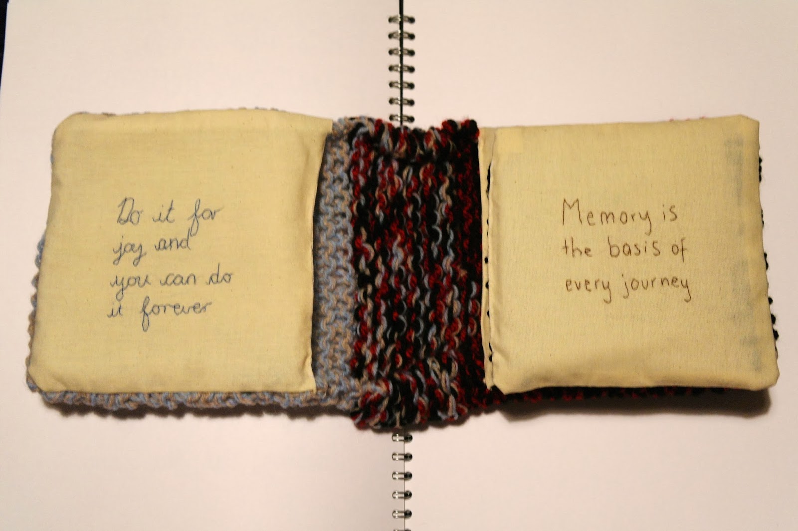
This is the experimental book which I have produced for the first half of my bookmaking project in my first term of third year Graphic Design. The book related to home, the textures and feel of the book remind me of home. The knitting symbolises where I learnt for to knit and by whom; my grandma. The book immediately looks cosy and inviting, the same qualities I believe that my home has. The inside pages are covered with Stephen King quotes as he is an author loved by all of my family.
At first the quotes are inspirational and thought provoking whereas towards the back of the book it becomes more in the style of horror of which Stephen King is famous for. The first impressions of this book are that of kindness of warmth, the more the journey of the book takes place the colours, obscurity and feel changes.
The gradual change of feel in the book can clearly be seen in these layout photographs. At first the text is stitched in joint up handwriting eventually becoming red stamp text which is obscured to look like blood. This relates to some of the characters in Stephen King's novel such as the clown in IT. I enjoy this sense of change in the book and the different in visual language on each page. Causing the book to become more appealing to the viewer and exciting.
The above photographs show the pouch that I created in the front and back covers of the book. Here I will place secret items that can only be seen if the viewer finds them as they are well hidden within the knitting. In the front blue/beige cover I will place positive and happy things such as shown here a letter I received from my Gran. Whereas in the back black/red cover which reflects more of the horror side I will place unhappy and negative things. I believe this adds an exciting feature to the book which only the most inquisitive minds will discover.


