Sunday, 16 March 2014

D&AD Make Your Mark - The fabric of my life


This year I am entering my work into the D&AD New Blood Awards for the Make your mark brief. I had to think of something which made me different to everyone else. 

I believe my craft skills make me different from others along with the handmade feel. Being able to pick something up and feel the textures and look closely at the details is something important to me. This 'book' named 'The fabric of my life' opens up to be a patchwork wall hanging. It includes 21 squares, each pattern related to what I wore on each one of my birthdays.

This book is unique to myself. The loose stitching style I have used give the feel of imperfection, something which reflects myself. 
No-one is perfect!


The back of the book includes a pocket which inside holds a key to the patchwork. Explaining each pattern and its relevance to myself.


Thursday, 6 March 2014

Afternoon Chinese Tea


Continuing my purposed range for Cath Kidston I have developed an afternoon colour scheme to apply to a pattern. Appealing these to teapots and teacups in the same style as previous posts. The next step in this project is to layout all these elements together in a pattern. To be ultimately transferred onto homeware, fashion and accessories. 

Thursday, 20 February 2014

Morning Chinese Tea

As part of the YCN Cath Kidston pattern in which I am creating I need to think of three different colour ways as part of the competition criteria. The patterns I am creating relate to chinese tea; the previous pattern was influenced by the neon lights in Hong Kong and so has a night time influence. 

I am therefore thinking about morning and afternoon times for the other two colour ways. These being the times that people have tea and the different reasons for this. The morning to start off the day and the afternoon to relax and socialise with friends. Firstly thinking about morning tea I have created this coloured patterns of parasols and lanterns.


Similar to the style of the night time teapots and teacups and applied this pattern to the same objects as seen below. These are striking as either individual pieces or together as an element in a pattern. These are fresh, bright and appealing; encompassing the feel and vibe of a bright new day.


Tuesday, 11 February 2014

Chinese tea - Cath Kidston patterns


For my final major project at university I am creating a new pattern for a Cath Kidston range as part of a YCN student competition. Choosing an oriental theme I was inspired by Chinese lanterns, parasols and tea. Creating a pattern by combining these three elements has created something interesting. The colour scheme is inspired from neon lights in Hong Kong which hold bright, vibrant colours. These are fun and quirky, something which I believe the Cath Kidston brand represents.


Tuesday, 4 February 2014

Self Promotion


As part of my professional practice module at university I am creating a logo for myself to apply to business cards, letterheads, personal portfolio, cv etc. 

My work has a handmade feel which I want to portray in the materials I use to produce both my logo and the items it will be placed on. I have experiments with stitching and stamping. The idea of producing something which will be placed slightly differently on each item by a stamp is something which interests me. 

These are the initial sketches and ideas I have produced so far. I am planning to use a neutral colour scheme which links with my current project work which will be in my portfolio.

Sunday, 19 January 2014

Life is Tweet


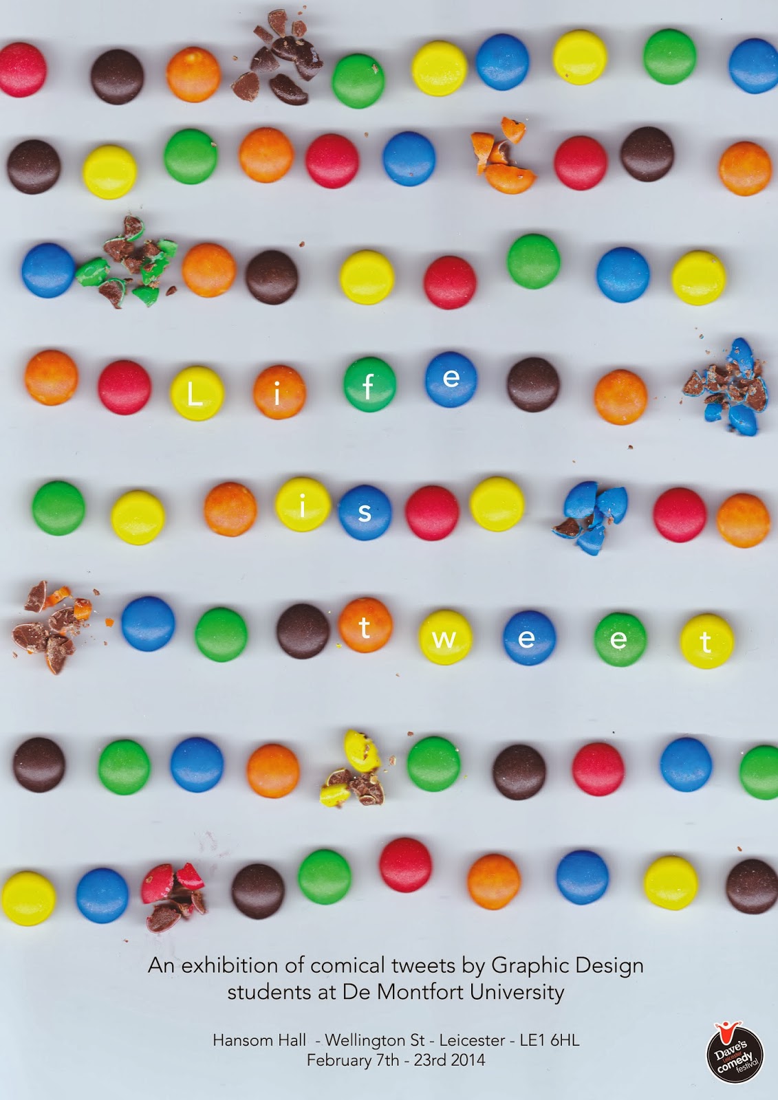
My poster for an exhibition which is part of the Leicester Comedy Festival next month (February 2014). The exhibition includes a series of graphic interpretations of funny tweets by Graphic Design students at De Montfort University. 

My inspiration for the poster was playing on the phrase 'life is sweet' by lining up sweets. The ironic side of this is that some of those sweets are broken. Furthermore they could be said to look like small tablets lined up on a table.

Tuesday, 3 December 2013

Let's get this craft started! Magazine


Developing my work for the craft magazine I am creating as part of my final year of my Graphic Design degree I have explored further with typography. The piece above was created using a sewing machine and then hand stitching. This is stitched onto tracing paper as I like the visual excitement of being able to see all the lose threads as well. This scan will be used on the front page of the magazine. Each issue will have the name created in different forms of craft i.e. fabric and collage.


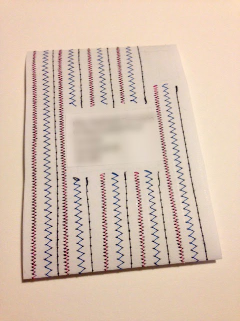
This is a mock up of how I will send out the magazine each week. This belly bound format will be stitched into like seen above. Each week a different pattern and colour scheme. The address will be placed in the centre and a stamp in the right corner; like normal letters. The magazine will be placed through the centre. This will actually be stitched onto paper for each person receiving the magazine, as apposed to the other pages which will all be scanned images.